My two-year journey at an S&P 500 company
Wake the fuck up, Samurai! We have a city to burn.
— Johnny Silverhand
Roles on Duty
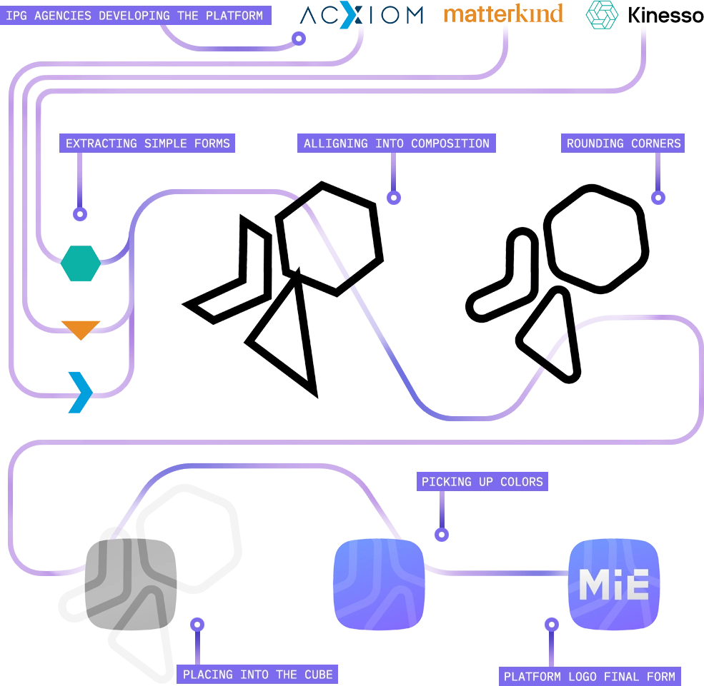
Lead Product Designer @ Product Design Department, Kinesso (an IPG company)
PROLOGUE
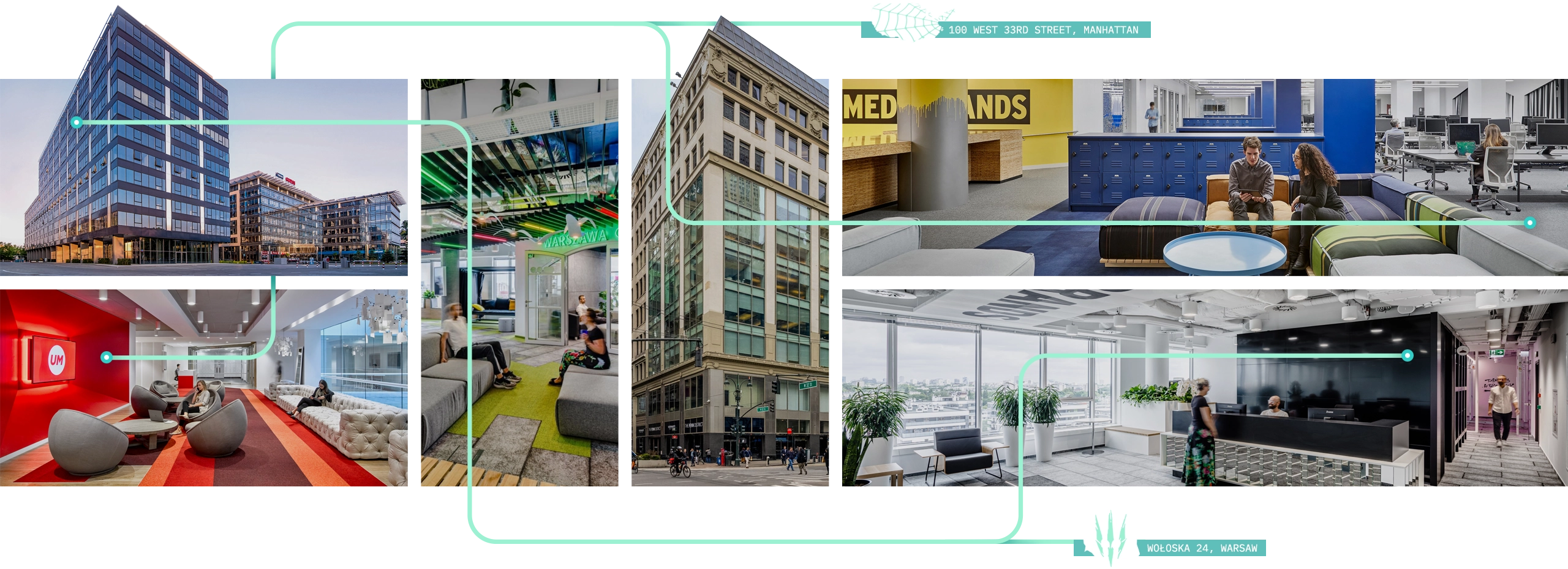
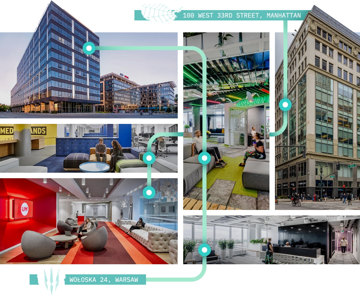
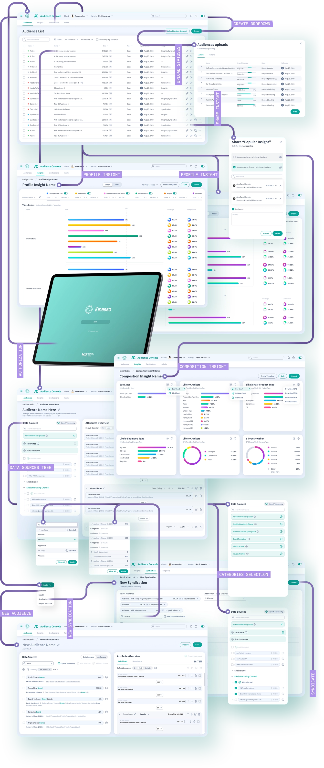
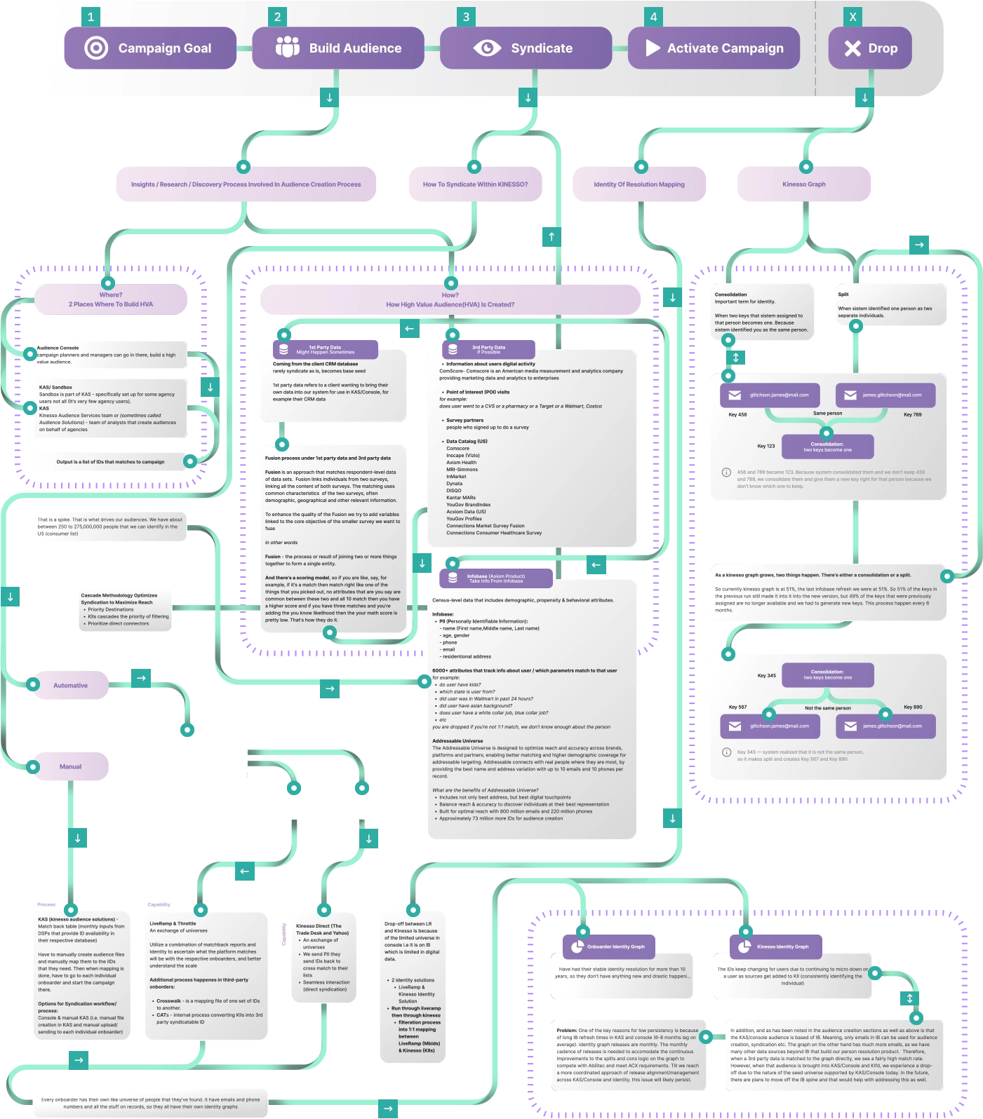
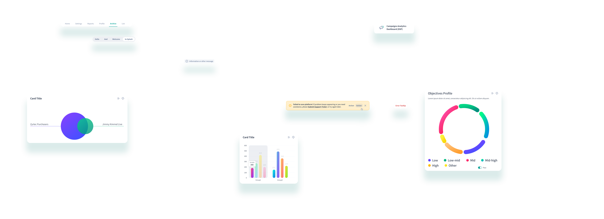
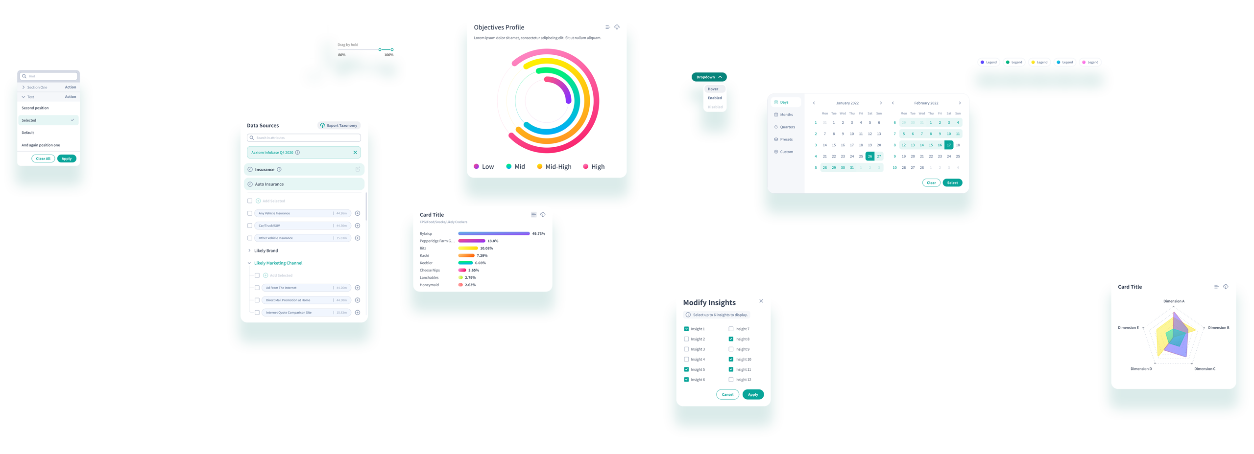
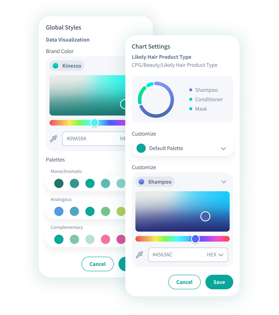
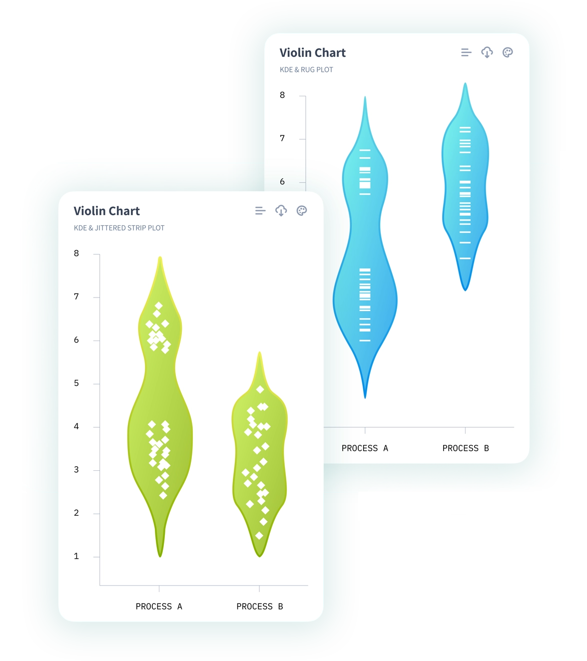
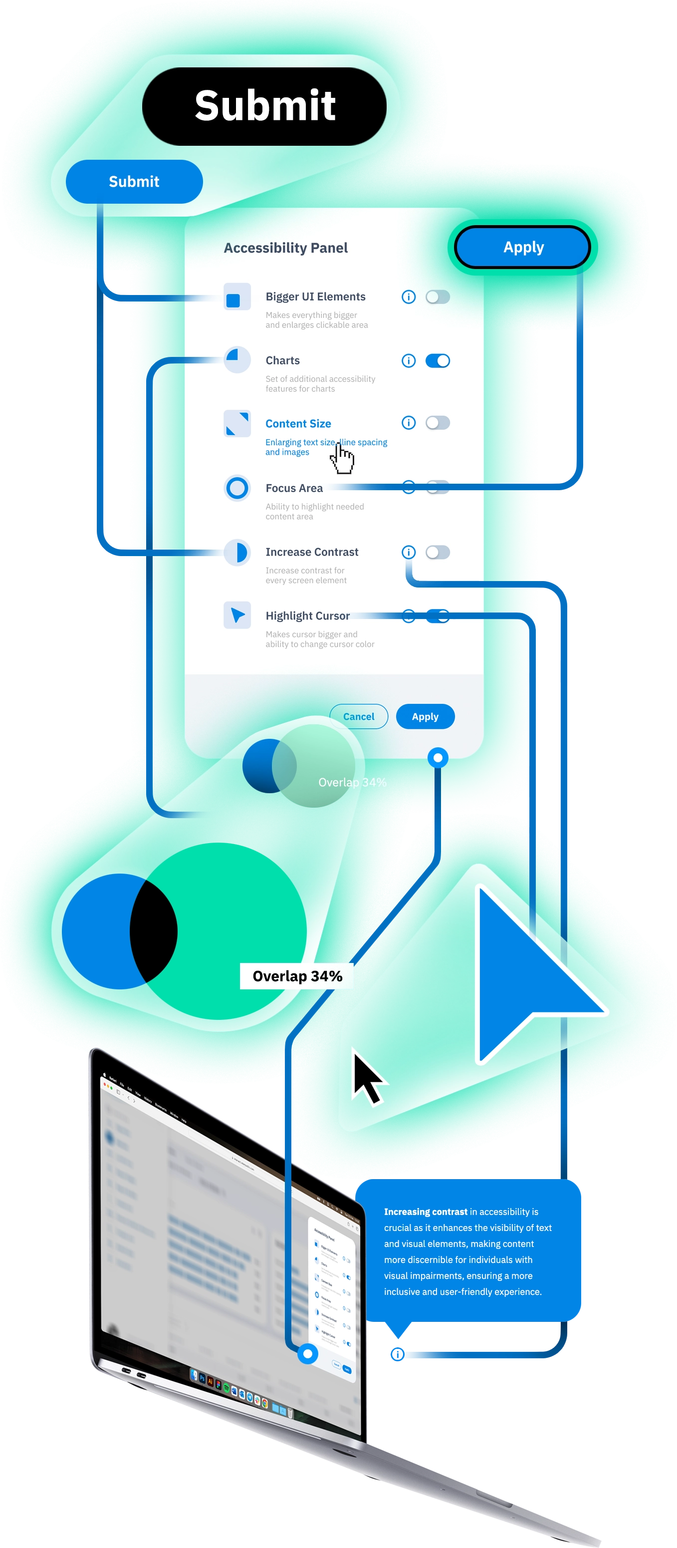
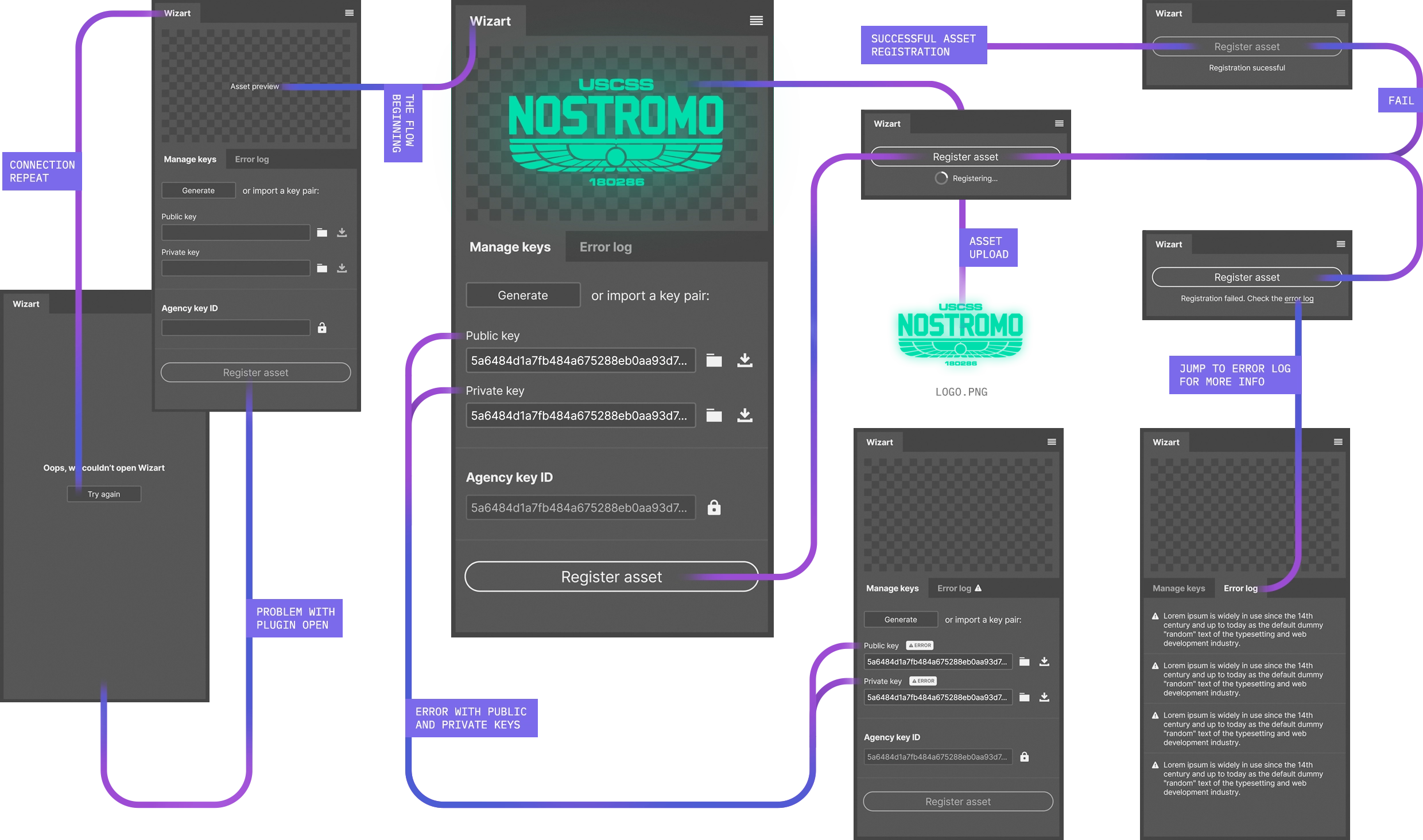
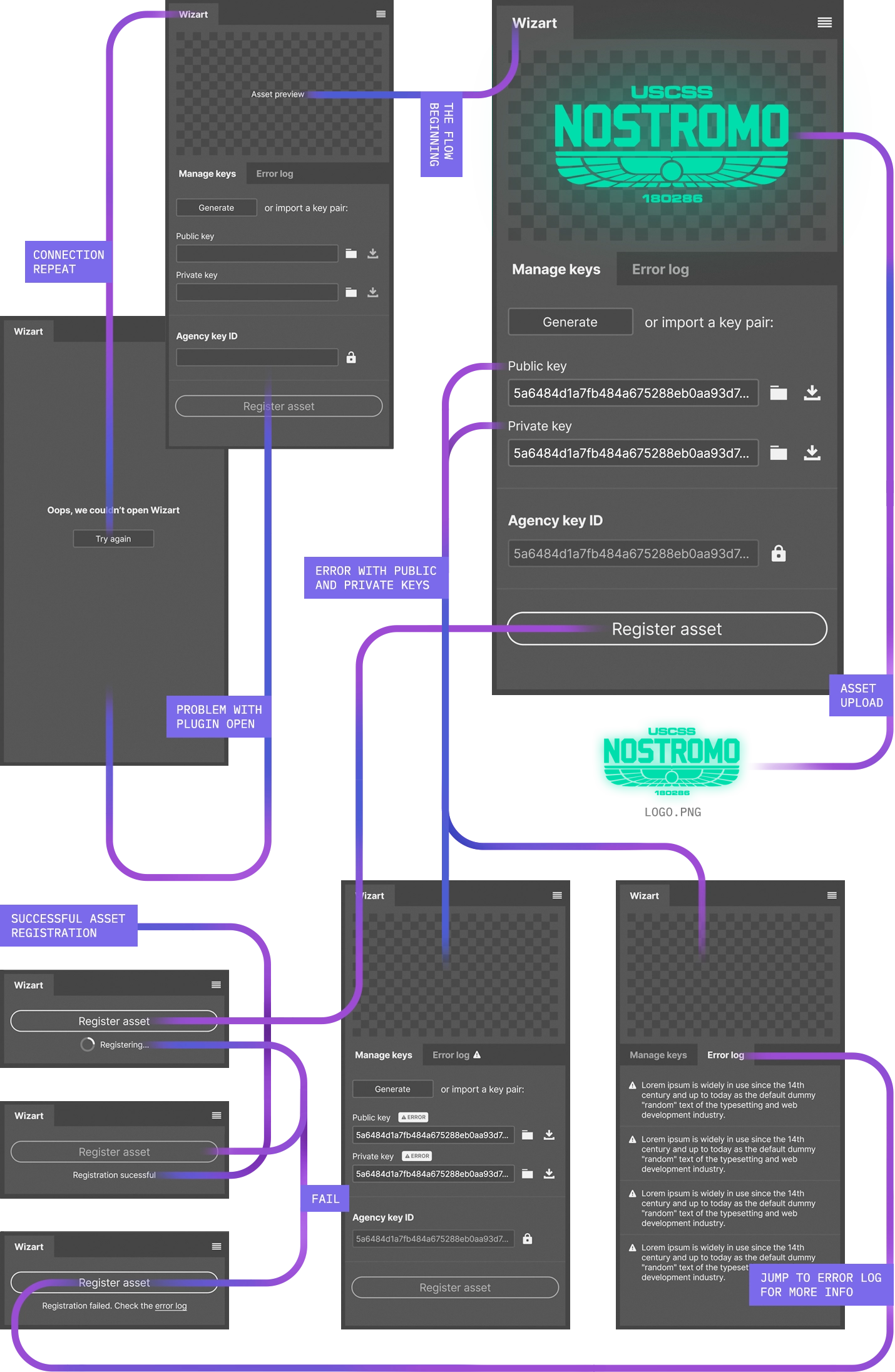
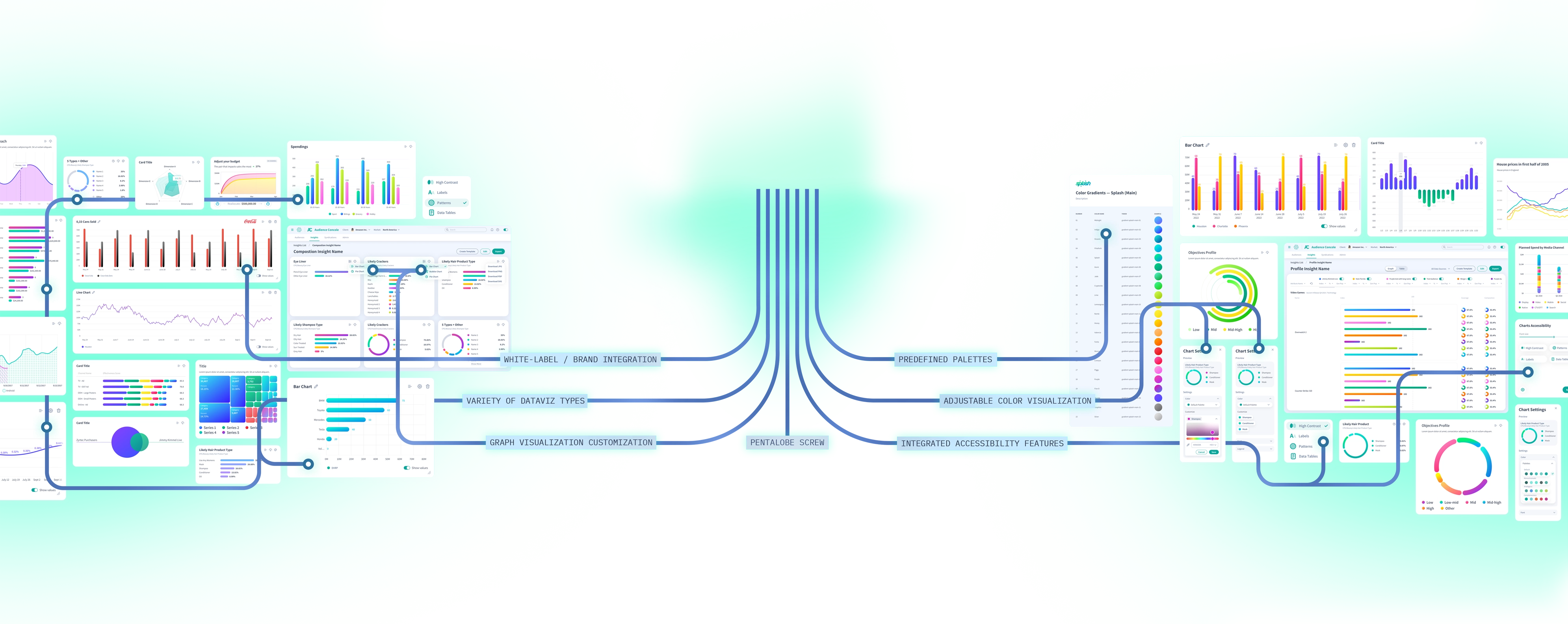
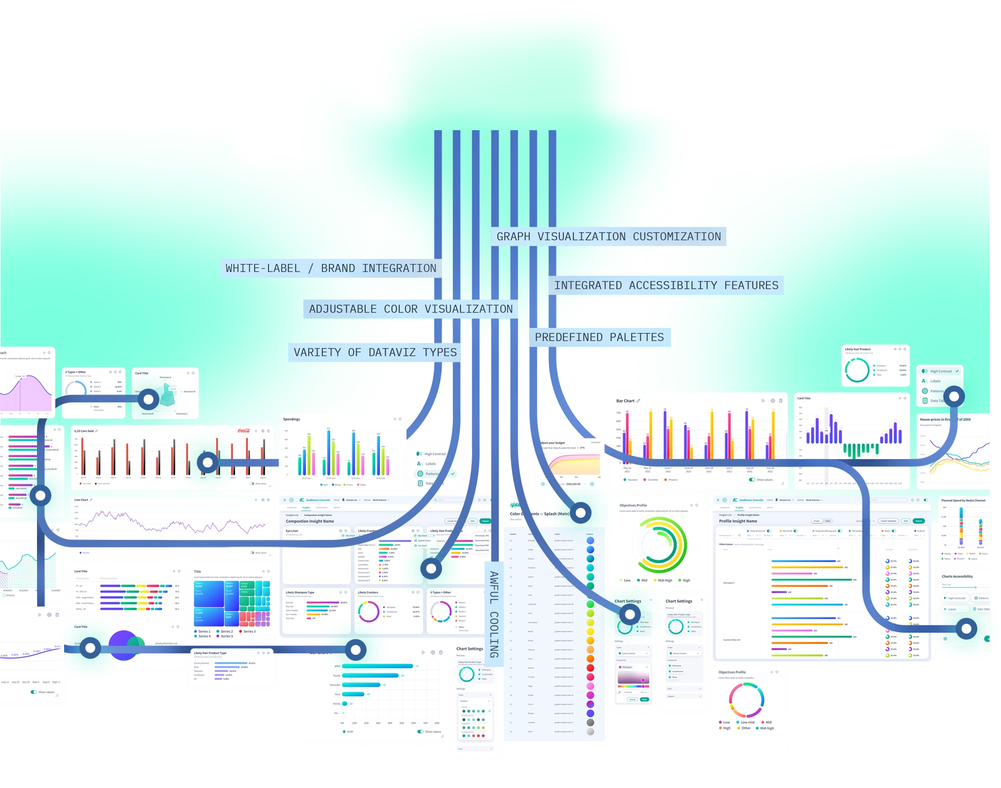
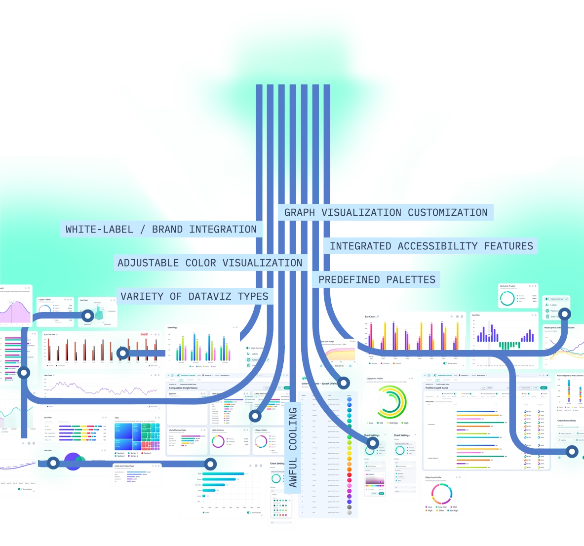
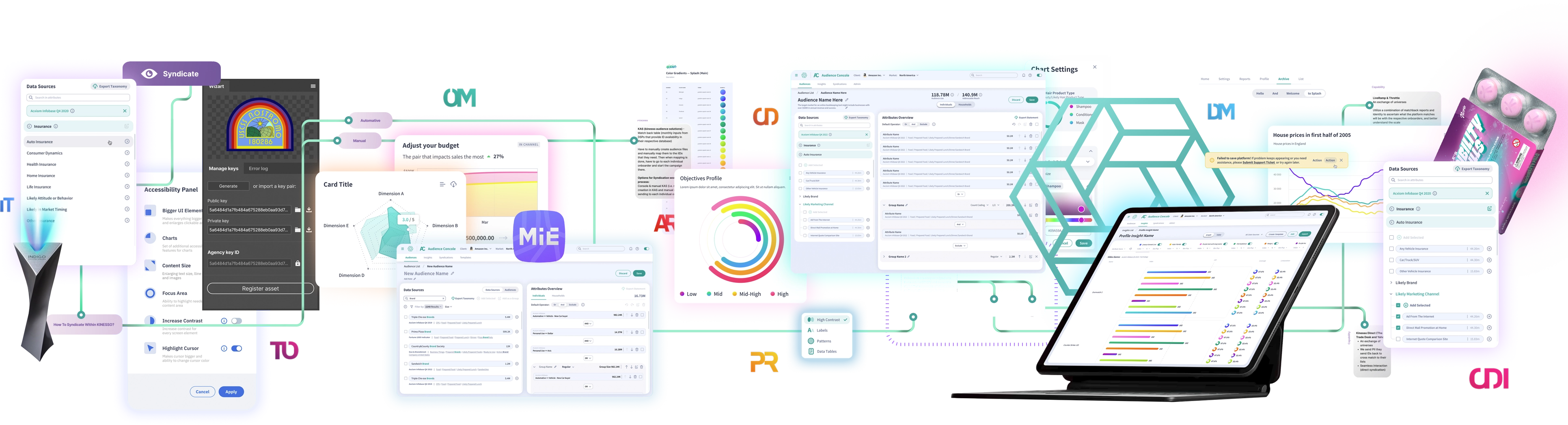
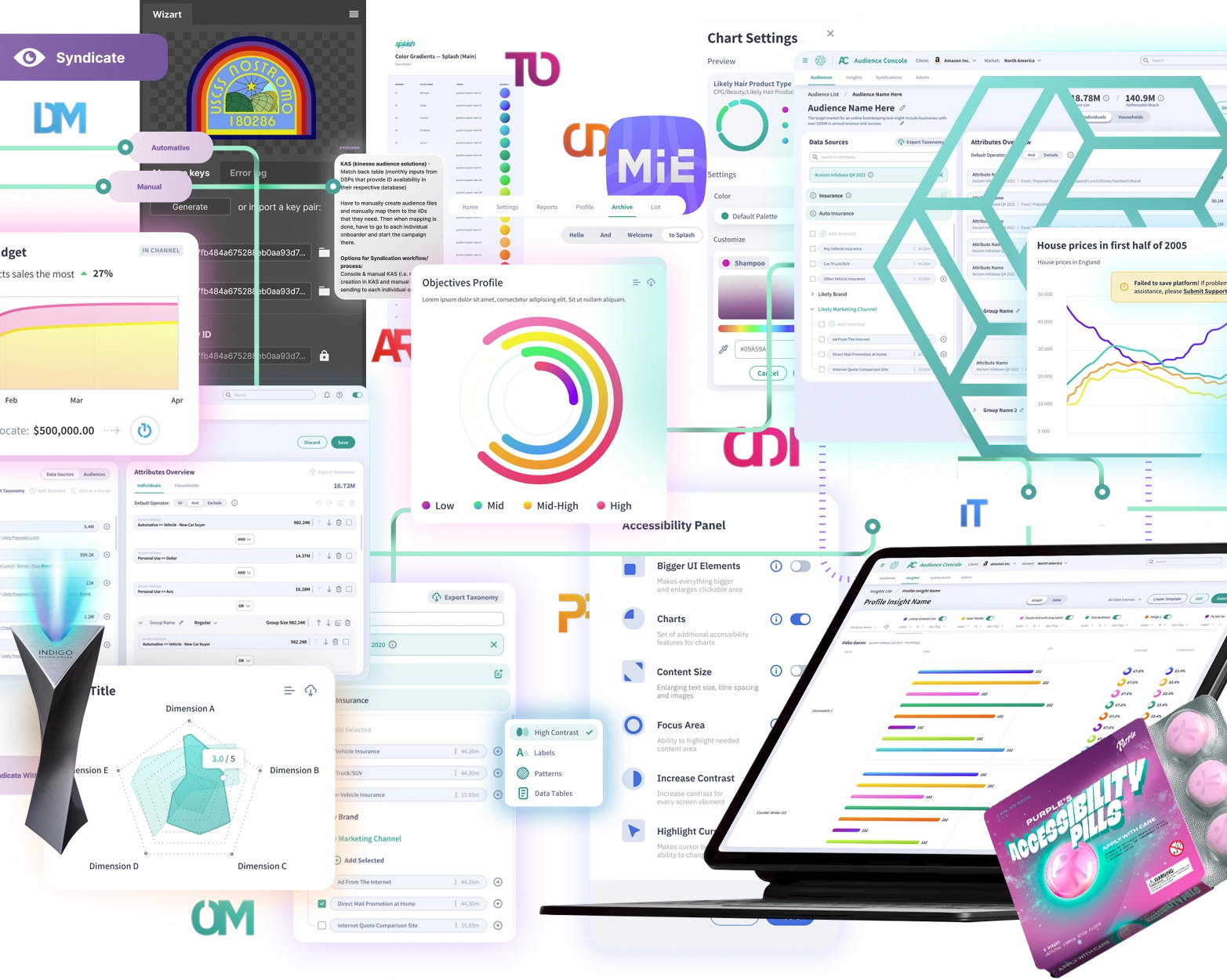
Life is like a box of chocolates, remember? You never know what you're gonna get. This particular piece led me straight to the heart of Manhattan, to the role of Lead Product Designer at Kinesso, a subsidiary of IPG. On my very first day, I couldn’t have imagined just how deep the rabbit hole would go. In this short article, I’ll try to avoid slipping into scribomania or turning this into a memoir. Instead, I’ll share some of the most fascinating aspects I encountered in this role.
I’ll divide my story into two parts. The first part, more formal, will focus on my achievements related to my primary responsibilities and tasks. The second part —the fun part — will share what I accomplished when I grew tired of limiting myself to the tasks at hand.
I know it might sound unusual, but let me explain everything in due course. You might also feel that, at times, I come across as boastful. And although boasting isn’t in my nature, within these pages, I’ll allow myself a little indulgence — because it’s just you and me here, and of the two of us, it’s my turn to vividly describe what makes me an exceptional professional.
Part I
Well, that escalated quickly
INTRODUCTION
In this section, I’ll talk about the structure of my team and the innovations I introduced, both within my team and across the entire design department. I’ll also cover my primary responsibilities and the achievements tied to them — accomplishments we reached together as a team, as well as those I contributed to as a manager and team lead.
The Team
In the design department, which comprised over 30 people, a clear hierarchical system was established to streamline management. Within this system, all product designers were organized into teams consisting of specialists at various levels, from Junior to Senior. Teams were also structured to cover all core areas: UX, UI, and Research.

The flagship product of Kinesso is the MIE (Marketing Intelligence Engine) Suite — a collection of applications designed for the comprehensive management of advertising campaigns across various platforms, from Facebook to television. In total, the suite includes over 40 interconnected applications, linked not only by their purpose and functionality but also visually through a unified design system. Each design team was assigned specific applications within the MIE Suite, working alongside stakeholders to monitor, develop, and enhance their respective applications.
As a team lead, my core responsibilities included managing teams, communicating with stakeholders, reporting to senior leadership up to the C-level, delivering quarterly presentations on the department’s achievements at roadmap events, collaborating with other agencies within the IPG group, mentoring junior employees, conducting quarterly reviews of my team members, interviewing new hires for the design department, and fostering team and corporate culture. Do you make the team, or does the team make you? In my case, I believe both statements hold true.
As for managing my own team, I must have been quite good at it, as leadership soon decided to entrust me with a second team. This made me the only team lead in the entire design department to oversee two teams of designers simultaneously. Ironically, this didn’t translate into more Eurobucks in my pocket, but it certainly boosted my street cred. Later, to streamline management, I merged the two teams into one larger team called Team Purple. How cool were we? Well, let’s just say we were the only product design team that not only had its own logo,1 but also its own merch. Yep, we were rockstars like that.
Wha.. What’s that you’re saying? That I haven’t been boasting enough? Well, don’t worry, I’ll fix that right now. Let me quickly list the innovations I introduced, first within my team and later across the entire department: a new template for conducting UX research interviews, a new format for weekly progress reports to department directors, a checklist and onboarding guide for new hires in the design department, the creation and implementation of Audience Flow Documentation, and the development and rollout of a brand system for the MIE Suite.
1 — any resemblance to real brands is purely coincidental.
MIE Suit Products
Now we’re getting to the more interesting part — finally, I’ll show you some visuals. As I mentioned earlier, each team was assigned its own products. The flagship product of our team was called Audience Console. Describing this program in words is straightforward: its primary function is creating audiences for advertising campaigns. By the way, it’s arguably one of the most critical and essential programs in the entire MIE Suite. However, making it simple and user-friendly turned out to be anything but easy. In fact, it was incredibly challenging.
Over the two years we spent working on this product, we undoubtedly managed to improve it and elevate it to a whole new level. Through the efforts of the entire team — enhancing and refining the design, conducting dozens of user interviews, research studies, and user tests — we succeeded in catching the attention not only of stakeholders and final users but also of C-level leadership.

Next, I’ll show you some vibrant visuals with the results of our work.
Unfortunately, we both understand that to fully grasp and appreciate these visuals, one needs to be immersed in the context. And since I happen to think highly of you, attempting to explain the entire context would be disrespectful. Let me just say that it took me about a year to start seeing and understanding the full picture, rather than just the small fragment within the narrow scope of my perspective. When I first joined the company, during the onboarding process, I came up with a joke that there wasn’t a single person in the company who understood and knew all the processes from start to finish. About a year later, I realized that my joke wasn’t really a joke. But this isn’t a critique of the company — it’s simply the nature of working in a large organization.

In addition to our main product, Audience Console, we also worked on a number of other products within the MIE ecosystem. However, we probably won’t delve into each of them in detail, as the design approach is systematic across the board. Plus, I’d like to respect your attention — you’ve already read so much, and this is only the beginning.
Audience
Flow Documentation
↑ This is me, trying to understand the flow of the audience within the MIE suit
Remember how I recently mentioned that there wasn’t a single person in the entire company who understood all the processes from start to finish? Well, I admit, I stretched the truth a little — there were a few people who had a rough idea of what was going on. Nevertheless, there was a clear problem with understanding the processes, and my team and I volunteered to solve it. Not just for ourselves, but for anyone else who might want to make sense of it all. After all, it’s incredibly difficult to develop a product when you only know a specific segment of the journey and can’t see the entire path from beginning to end.
The asset we created was called Audience Flow Documentation — essentially, it was a massive flowchart (a picture is worth a thousand words, right?) accompanied by documentation that outlined every step in the lifecycle of an Audience: from defining the end goal of an advertising campaign to audience syndication.

Over several months, we did an enormous amount of work, conducting multiple interviews with the company’s veterans and C-level executives, who explained the tiniest details and nuances to us. We, in turn, translated this knowledge into a clear and easy-to-understand diagram.
↑ Well, yeah, for obvious reasons, it's pretty hard (if not impossible) to read all of this. But trust me, you don't need to dive into it. Unless, of course, you are an industrial spy. In that case, reach out to me.
This is the magnificent asset we ended up with. The diagram also came with supporting documents that described all the key processes and intricacies. I’m confident that the result of our work still brings value and helps people within the company to this day.
Splash Design System
All the software products in the MIE Suite are built on the Splash Design System. Splash is a highly complex, comprehensive, and flexible design system, born from the creativity of many members of the product design team at IPG Agency. Many of our colleagues (yes, including me, of course) have made significant contributions to the development of this design system, which, by the way, has won numerous awards over the years.
For the product owner of the design system, the biggest challenge was maintaining order within it — because if each of the more than 30 designers in the department decided to add their own touch, things would quickly go south, as we all well understand. For us designers, the real challenge wasn’t inventing new elements but solving the tasks set by product owners and stakeholders while sticking to the existing components. Sometimes, this required some serious thinking (not like usual, haha).
However, on occasions when introducing a new element was justified, you’d go through multiple rounds of approvals at various levels of management, and if your element became part of the design system, you’d earn honor and praise — after all, you left your small mark on the collective effort. I was lucky enough to achieve this a few times. Here, take a look:
color picker & theme selector
As part of the Data Visualization Initiatives (which I’ll describe in more detail below), the Splash Design System has been enhanced with functionality for centralized management of product theme colors and data visualization. It allows users to choose from predefined themes and palettes or to create fully custom color solutions.
DATA VIZ PREDEFINED GRADIENTS
For the Splash Design System, I created a set of gradient palettes specifically designed for data visualization. The main challenge was to ensure that charts and graphs remained legible even when using a large number of colors. I also decided to add a touch of creativity by giving the gradients expressive, meaningful names.
Violin chartS
One day, someone from the science department (yes, apparently we had one) reached out to me — super smart guy — and asked me to create a Violin Chart for some very complicated, brainy stuff. Need to say, I had to level up my own IQ a bit to make it happen.
additional icons
The Splash Design System comes with quite a few icons straight out of the box. But, honestly, there are never enough — and drawing icons is just plain fun. It’s relaxing and keeps your brain sharp at the same time. And, surprisingly, it’s way trickier than it looks.
freightliner cascadia
Thank you for taking the time to explore my site — I really appreciate it. As a small token of gratitude, I’d like to share something truly magnificent: the Freightliner Cascadia, fifth generation. Because beauty takes many forms — and sometimes it has 10 wheels.
Working on and contributing to a real, 'grown-up' design system is a unique experience, and I wish every specialist the opportunity to gain it.
Part II
The Nitty-Gritty
INTRODUCTION
As it turned out, both my team and I completed all assigned tasks very quickly, leaving us with a significant amount of free time. Sure, we could have just lounged around, doing nothing, and no one would have said a word. But that would have been boring and unimpressive, so instead, I decided to personally debunk the saying 'initiative is punishable.' Some of my initiatives were quite large-scale, involving not only other departments at Kinesso but also neighboring agencies under our parent brand, IPG.

In the second part of my story, I’ll share andshow the results of the adventures and escapades we embarked on, aiming notonly to fill our free time but also to prove to everyone that we’renot sosimple — that a good reputation is earned not just through blood,sweat, and tears, but also throughbrains.
Accessibility Project
Unlike all the other teams, ours had an additional specialization — Accessibility. This was mainly because one of our team members was (and still is!) a certified expert in this field. For a long time, a so-called 'Accessibility Project' had been floating around in the general backlog of the product design department — a rather important and complex initiative to implement all necessary accessibility features across all products in the MIE Suite. As they say, it was a perfect match, and as soon as time was freed up for the project, I made a few calls and convinced our leadership that handing it over to us would be an excellent idea.
What followed was an extensive research phase, during which we conducted a series of interviews with users who faced various challenges related to disabilities — for obvious reasons, finding such individuals within the product’s client base was no easy task. This allowed us to gather firsthand data. Based on this data, we identified a set of priority features for implementation and compiled an impressive list of subsequent features for the backlog.
The image above lists the features from the first phase of implementation. Access to the control panel is provided through a dedicated persistent button, which is consistently located in the same place across the entire ecosystem.

This panel also became part of the Data Visualization Project, which earned our department several awards—but more on that later.
Wizart Photoshop Plugin
That’s how I learned how to make a Photoshop plugins. Our team didn’t just work on the plugin’s UI and UX — I decided that we absolutely had to come up with a name and a logo for this product.

The plugin’s functionality was quite simple — it sent graphic assets directly from Photoshop to MIE applications. So, technically, this side initiative was directly tied to our main product.
2 — Of course, this detail is completely unnecessary, but I’m just trying to spice up and embellish the narrative. After all, you’ve come quite far in reading this, so I want to reward you for that.
MIE Branding
This was my personal side project, which I worked on for over a year. As it happens, alongside my core skills, brand design is one of my favorite areas, even though it comes in handy less often than I’d like (which is why it — the skill — requires constant practice).

So, let me start with a bit of context to make it somewhat clearer what exactly I was trying to achieve over the course of a year. The MIE Suite is a collection of over 40 applications, each tailored to its own specific function. MIE is a product developed by IPG, which includes more than 20 advertising agencies, each using applications from the MIE Suite under their own brand. At the start of the project, neither the MIE product itself nor any of its applications had its own logo — and that’s exactly what sparked the idea: 'Oh,' I thought, 'this is something that can be improved.'
Creating the general MIE logo was relatively straightforward. It was a standard logo that didn’t appear overnight—it went through several iterations, approval stages, and revisions. In short, it was a typical production process. At the beginning, there was even a small internal competition where different employees proposed their approaches. Well, needless to say, I won the competition, ha.
Here, step by step, you can follow the process of the MIE logo's creation. As you can see, I’ve included a tiny Easter egg — a nod to the three key agencies involved in developing the Marketing Intelligence Engine.
But, as they say, out of the frying pan and into the fire. What I mean is, that was just the warm-up, and then the real challenge began (see: complexity).

The brand system required a systematic approach to creating logos for applications because new agencies and new applications kept emerging. For obvious reasons, the company didn’t have the resources to create new logos for every new agency/application combination. This was the problem my brand system solved—with its systematic approach, we not only generated over 1000 conditionally unique logos at once but also minimized the time required to create new ones.

PAN to go through all of the logos →
By the end of the project, each of the more than 50 MIE Suite applications under each of the 22 IPG agencies had its own unique logo. Ultimately, the design was approved and integrated into the Splash design system, which, as I mentioned earlier, served all MIE software products.
Data Visualization Initiatives
An attentive reader might remember howfervently I boasted about how good, fast, and efficient I was at my job,leaving me with plenty of time for various initiatives, corporate adventures,and escapades. Data Visualization became one such initiative where I wasfortunate enough to play a key role.
The essence of this project was simple3: within the Splash design system, provide users with a set of features and tools for more flexible data visualization across the entire MIE ecosystem. What does that mean exactly? Need your charts in red because you work for Coca-Cola? Now you can do that. Want to create your own color presets for data visualization? Now you can!
Struggling to distinguish a specific color or finding the content too small? The Accessibility panel is at your service. You can either choose from predefined color schemes or create your own. Everything is designed to make your data work easier: the already flexible data visualization in the Splash design system became even richer!
3 — Well, as usual, simple in concept but not in execution. The implementation took countless man-hours!
The set of features and improvements turned out to be so good and user-friendly that our leadership decided to enter the Indigo Design Awards competition. As a result, we didn’t just win — we took home 3 gold and 2 silver awards.
In this way, I made a significant contribution to the development of the Splash design system and, thanks to this, became an award-winning designer—something I try to brag about more often (but don’t always succeed). So, as I said earlier, initiative isn’t always punishable.
AWARDS

Find the list of awards we won below, and if you want to explore more, jump on the indigo awards
Gold winner
Digital Design for Graphic Design
Gold winner
UX, Interface & Navigation
Gold winner
Digital Tools and Utilities
SILVER winner
Interaction Design for Graphic Design
SILVER winner
Interactive Design
Feedback

I’m not a movie, but the stars listed below would be well-deserved if I were.

We both understand perfectly well that no matter how eloquently I sing my own praises, it would be nice to back up my words somehow. That’s why I’ve gathered a few excerpts from the feedback I received from my leadership and colleagues at Kinesso — perhaps this will convince you, my dear reader, that at least some of what’s written here isn’t just a figment of my imagination.
Feel free to explore all of my recommendations on my LinkedIn recommendations page.
EPILOGUE

My two-year triumph came to an end for a rather mundane and sad reason — the parent company, IPG, decided to optimize budgets and let go of all contract employees. During this time, I grew significantly as a professional: I honed my team management skills, learned how to interact with C-level executives, and developed the ability to strengthen corporate values. I also left my mark on the development of both the design department’s culture and our shared product, the MIE Suite — I’m confident that many of our team’s innovations and improvements are still in use today.

IPG Kinesso is a place full of amazing people, where I made many connections and met several friends I still keep in touch with. It’s a place with the right and healthy corporate culture, where even the smallest cog in the giant corporate machine can feel important and special. I’m grateful for every day and every person I met along the way—because of them, I became undeniably the best version of myself. Taking this opportunity, I send a warm shoutout to all my former brothers and sisters in arms from the design department!
 ← GO BACK
CONTACT
To know me better, say hi or for detailed inquiry send me an email to m@fomchenkov.co